
navigate.st — brand
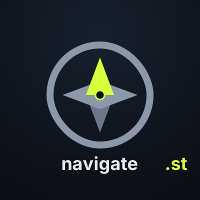
A compass rose inside a chain-link ring. The outer ring signals the Silent Mode family; the compass says what this specific site is: the wayfinding front door. Kit below.
A compass rose inside a chain-link ring. The outer ring signals the Silent Mode family; the compass says what this specific site is: the wayfinding front door. Kit below.



navigate.st shares the Silent Mode palette exactly — one accent, one text tone, a small spread of greys. Same tokens the site's inline CSS uses.
Anywhere navigate.st itself is the subject — the gateway page, its social accounts, docs about the relay tier. When Silent Mode as a whole is the subject, use the Silent Mode mark instead.
The chain-link ring around the compass is deliberate: it says "part of Silent Mode" without repeating the Silent Mode chain-links mark. If you remove the ring, this stops being navigate.st and becomes a generic compass icon.
The green north-point is the whole message — "there is a direction, and this is it". Don't recolour it. Don't rotate it (the compass no longer points north).
"navigate" in body text, ".st" in acid. Don't reverse them; "navigate" in acid reads as marketing, not identity.